The type of remote sensing data shown is the fire activity
detected by MODIS satellite. This is demonstrated through the use of circles
with varying colors to determine the time interval of the fire detection; Red
being most recent and yellow being the longer interval of detection. Applications
can be anywhere firefighters to researchers wanting to know what locations are
more prone to fire activity. The image itself does not give too much detail and
does not have good resolution. In google earth, the resolution changes as you
zoom into a location and the circle becomes a defined area which is helpful for
pinpointing the exact location of the incident. This information is relevant to
the management of fires and is made into Keyhole Markup Language (KML/KMZ) format
for use in Google Earth and other virtual globe applications. Geospatial data
are organized by different geographic regions. They include the location and
characterization of the type of detection including size and their significance
in the U.S.
Thursday, February 27, 2014
Wednesday, February 26, 2014
Orienteering map
This map shows a orienteering map and is designed to be used
for orienteering competitions. It uses a topographic map with additional
details included for the use of the competitor to be able to navigate through
the different areas. Land features
represented by symbols and can be interpreted in any language. These symbols
are defined by a legend in the bottom left. Contour lines are used to demonstrate
the terrain, and symbols and features include the forest density, water
features as well as roads and buildings. A scale is labeled on the top and uses
a ratio format. The base maps are usually LIDAR maps. Generalization is used
for these maps to include necessary details and to avoid confusion.
Friday, February 21, 2014
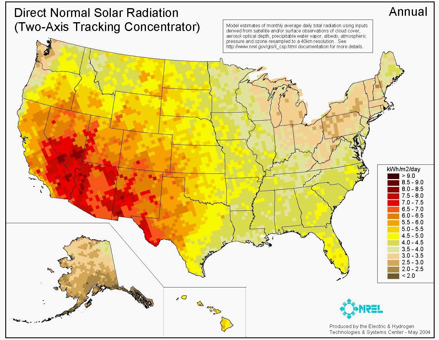
Choropleth Map

This map demonstrate the direct solar radiation
annually. A legend is provided to show the intervals and the corresponding
colors for a different amount of radiation. This max uses pixels to display its
information. This is known as a raster data. Each pixel corresponds to a value
representing the amount of solar radiation. Each pixel has a latitude and
longitude, so it is tied into the real world surface. A collection of daily satellite readings have
been compiled and entered in to display this information and determine where
the concentration of radiation is. http://www.nrel.gov/gis/solar.html
GIS
http://www.informationbuilders.com/solutions/gov-lea
This is an example of a GIS program that helps with crime
rate retrieval. Symbolism is used to portray the types of crimes committed. A
legend is not provided. This map does not have a lot of details and is very
general but there might be an option to turn on and off certain layers that
might add more details depending on what knowledge you want to seek. This map
only shows line work, colors, labels and symbols to demonstrate the most basic
information required. This GIS
allows the user to pan which allows you to view a larger area by moving to a
different portion of the map. You are also able to zoom in and out for more or
less coverage area.
Monday, February 17, 2014
Topographic relief map
http://en.wikipedia.org/wiki/Topographic_map
This map is topographic map of Stowe, Vermont, USA. This is a planimetric map. This map has
contours showing the elevations of the terrain. The solid bold lines are the
major contours and the lighter lines show 20 feet intervals. On the topographic map there are labels
lines and colors, all being used as symbols to represent different land
features. The blue shapes are water bodies and the black lines are roads and
there are also points that represent something. Symbolism is used a lot in this
map such as different line types. This map does not have a scale but leaves out
a lot of detail so that the user of the map can use the map efficiently for the
intended purpose.
Hypsometric map
http://3dfmaps.com/maps/terrain.htm
This shows a map of a body of land made with
software that can develop contours. This map shows reliefs, which are shaded
according to elevation and is a 3d map. This is known as a hypsometric map. This map was made using
the Lommel-Seeliger relief method. Mountains and peaks are
shaded a red, orange and green and blue are more even, level terrain. A legend
is to the right to display what the colors mean. This can also be done to show
any kind of information such as quantitative or qualitative. Different colors
can be used to demonstrate any the intended information (symbolism).
Isoline map
http://www.ssg-surfer.com/ssg/detailed_description.php?products_id=138
An isoline map shows a variable with a continuous line connecting points with the same value together. This map shows the predicted high temperatures for June 27.
This is a isoline map. It uses contours to demonstrate the differences in
temperature. A isoline map demonstrates a third variable, which in this case is
the difference in the predicted temperatures. The change in contour lines
represents the change in temperature, which is kept constant. The map also uses
very omitted amount of detail such as labeling major cities and only shown the
boundaries of the United States and all the states and omitting the ocean as
wells as Canada and Mexico. Also Alaska is not shown here. A legend is provided to define what color corresponds to what color.
Subscribe to:
Comments (Atom)


