Saturday, April 12, 2014

biogeographic maps


http://www.planetaryvisions.com/Project.php?pid=2218
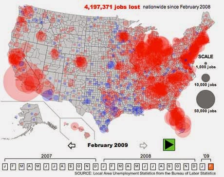
A biogeographic map is a thematic map that displays the distribution of species. This map is used to determine what organisms are where and what factors, geographically contribute to this. An example of this can be seen above in this graph displaying vegetation and regions. This is important for understanding where species are and migration patterns.

standardized choropleth map

http://www.directionsmag.com/articles/choropleth-mapping-with-exploratory-data-analysis/123579

In order to account for different sized land masses, the standardized map used aerially averaged data instead of the total value. this allows every sized unit to be compared to each other. An example of this can be seen in the above map of the population density. This is a better mapping technique of all choropleth maps because it allows for the comparison of different unit sizes. This map shows the population of different sized areas and shades them according to the quantile it falls into. Each area can now be compared to each other.

climograph


http://www.colorado.edu/geography/extra/geogweb/bouldercreek-2/preview/page2.html
A climographs display climate information such as precipitation or monthly average temperatures etc. This graph allows users to see the change in the measured variable throughout the year. An example of this can be seen above in the climograph of Boulder, Colorado. The graph shows the average precipitation and monthly temperatures for the year. this map is used to determine why flash floods occur in Boulder.

population profile


http://www.census.gov/2010census/
A population profile is a chart graphing all the distribution of the population according to their ages. An example of this can be seen above in the chart where the population is represented by their sex and age. This is an application used by the census to demonstrate the demographics of age group and sex in proportion to the total population.  

Index value plot

http://wattsupwiththat.com/2011/12/09/the-november-amo-index-goes-negative-first-time-since-1996/

An index value plots data on a line graph as index values instead of absolute values. A point of reference is also displayed and used to compare the data. An example of this can be seen above. This a line graph plotting the Atlantic Multidecadal Oscillation index. The point of reference allows the comparison to be made of when the values are negative (below the reference point) and when they are positive(above the reference).

Friday, April 11, 2014

Lorenz graph

http://www.rba.gov.au/publications/bulletin/2012/mar/3.html

A Lorenz graph displays a cumulative distribution function. It shows the proportions of a wealth distribution developed by Lorenz in 1905. It is mostly used in an economic application. The equality line is graphed as X=Y. The curve is the actual data graphed of the wealth distribution. This can be seen in the map above. The actual wealth and income fall below the equal distribution line. The percentages of each  wealth or income and households can be found on the x and y axis.

Bilateral graph

http://seekingalpha.com/article/241440-will-octobers-improved-trade-deficit-continue

A bilateral graph displays two related sets of variables/data through a bar graph, a histogram, a line graph etc. It make sit easier to see and observe more than one set of data at one time. An example of this can be seen above. This graph is a line graph displaying the US trade deficit for each month for the year 2009 and 2010. By using a bilateral line graph, the two sets of data can be compared and trends can be noticed.

Nominal area choropleth map


https://courseware.e-education.psu.edu/courses/geog482/policies.shtml

A nominal area choropleth map displays aerial data through the use of colors or patterns to define different areas or regions. The variable mapped is nominal and not ranked. An example of this can be seen in the map above. The variable being mapped are minority groups with the highest percentage of state population and each group is assigned a color.

Unstandardized Choropleth Map


An unstandardized Choropleth Map is a thematic choropleth that uses the original data instead of the average. An example of this can be seen above. This map is classified using the original data and is broken up into one fifth of the population in each class. 

Bivariate choropleth map

http://www.geo.unizh.ch/~annal/Choropleth%20maps.html

A bivariate choropleth map displays two variables one map, simultaneously. This is done by using two different symbols or colors/shading for each variable. This map makes it easier to observe a geographical relationship between two variables. An example of this can be seen in the map above. The two variables are the percentage of the population under 18, in red, and the percentage of rural population, in blue. By mapping them into one map, the places where they overlap are easier to observe and a relationship can be determined, if there is one. The relationship is shown by the bottom left chart.

Monday, April 7, 2014

Parallel coordinate graph

http://vis.lbl.gov/Vignettes/Incite7/

A parallel coordinate graph helps to organize and visualize multiple variables.  Equally spaced parallel axis are placed and lines connect at each axis(nth coordinate) depending on their ith value. An example of this can be seen above in this plot of beam revolution. the parallel coordinates help to demonstrate when the beam particles are injected into the simulation by using these coordinates.

Similarity Matrix

http://spie.org/x48704.xml?pf=true&ArticleID=x48704

A similarity matrix contains data sets or points and represent the similarity between these data sets. Each element contains a measure of similarity. In the matrix above, the burgundy diagonal shows the most similarly between the drug reponses. The blue elements had less in common.

Triangular plot

http://www.dplot.com/triangle-plot.htm

A triangular plot graphs three variables, one each side. Any three variables plotted sum up to one and are independent of each. An example of this can be see above. This triangular plot is used for geotechnical applications for classifying soils. The three variables plotted are different soil cassifications. A soil can be classified by just knowing the percentage of two variables. They are independent of each other.

Unclassed choropleth maps

http://www.agroatlas.ru/en/content/climatic_maps/S_Temperature/S_Temperature_01/
An unclassed choropleth is a similar to a classed choropleth, but it does not have a set number of colors. Many different shadings of colors are used to depict the variable being mapped. It is a thematic map. An example of this is seen in the map above which maps the mean annual air temperatures for different portions of the earth. All the different shades are represented and defined in the scale on the bottom of the map.

Range graded proportional circle map

https://www.e-education.psu.edu/geog160/c3_p14.html
A range graded proportional circle map uses a set of circles that represent a certain amount and include a legend.  These circles measure a variable and are proportionate to the value measured, unlike continuously graded proportional circle maps that use a scale. An example of this can be seen above in this map depicting unemployment in the US in the year 2000. Each circle represents a range and only five different sized circles will be found on the map.

Continuously variable proportional circle map


http://www.theguardian.com/news/datablog/2009/apr/13/week
Continuously variable proportional circle map is a map that uses circles to represent data. These circles vary in size depending the the proportion of the variable being measured for the land area. An example of this can be seen above in this Continuously variable proportional circle map. This map shows the unemployment over all of the US. The large circles over the southern portion of California demonstrates that there is a large number of people unemployed in that region of California.

DLG


A DLG, digital line graph, is a cartographic map of of vectors that are digital representations of cartographic information. These graphs are derived from USGS quadrangle topographic maps. An example of this is seen above. This map contains lines (vectors) that contains different information.

DRG


A DRG (digital Raster graphic) is a scanned digital image of a USGS survey topographic map. It is done for computer use. They are normally used in GIS applications.  An example of this can be seen above. This is a portion of a DRG of Texas. This can be used in GIS software as a layer because it is georeferenced to the Earth's surface.

Sunday, April 6, 2014

Isopachs

http://www.southampton.ac.uk/~imw/Durlston-Bay-Lower-Purbeck.htm

An isopach is a map that uses contour lines to represent a stratum or a group of strata that share the same thickness. An example of this is seen in the map above which shows the total Purbeck formation and the thickness is measured in feet. The isolines connect the points sharing similar thickness values.

Isohyets


An isohyets is a line on a map that connects points that have the same amount of rainfall in a
given time period. An example of this is in the map above. This is an image of a map the amount of rainfall recorded  by the Hong Kong Observatory from the 25-30th of August in 2004. Each line connects the points representing locations with the same amount of rainfall in the given period.

Isotachs


An isotach is a line on the weather map that connects points with similar recorded wind speeds. An example of this can be seen above in this weather map of the US. This map gives the temperatures and wind speeds taken on April 10, 2009. The wind speeds lines, isotachs, are labeled to show the values of all the points on the line.

Isobar Map


An isobar is a line on a map that connects points that have the same atmospheric pressure at a given time or over an average time period. An example of this is in the map above. This is an image of a weather map on the weather channel. The lines circling the L (low pressure) and the H (high pressure) are isobars and the points along the lines all correspond to the same pressure.

black and white aerial photography


Black and white aerial photography is an aerial photo that captures the same wavelength as the human eye, visible light. it is great for showing roads, shorelines, parcels and obvious details but not as detailed as the infrared aerial photos. Above is a black and white aerial taken in 1937 of Salt Lake City. This image was taking to show the urbanization that has occurred in the last years since the earlier aerial photograph.

Infrared aerial photo

http://geography.wr.usgs.gov/science/sacWetlands.html

Infrared aerial photography are pictures taken using devices that capture the infrared radiation given off by the earth's surface or other objects. These pictures are usually large land areas and can help show the changes in the land over time. Above is an infrared aerial photo of a wetland in Sacramento on the USGS website. Each color in the photograph represents the land.For example red shades represent more live vegetation and blue shades are dead vegetation or high in moisture land. This is shown here in the wetland photo.

Cartogram

http://commons.wikimedia.org/wiki/File:Cartogram-2008_Electoral_Vote.gif

A cartogram is a map that organizes statistical information. A variable is chosen and is represented through land area and colors to represent a type of data. Above is an example of a cartogram and the variable being represented is the 2008 electoral projected votes. Each candidate is defined with a color and the areas shaded that color portray the majority vote in that area. This map uses land area to portray the projected voting for that area.